To provide services at the highest level, we use cookies as described in our cookie policy. By using our website, cookies will be placed on your device. You can change your browser settings at any time. Check our cookie policy.
/All articles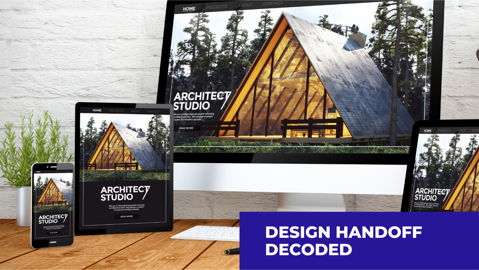
Responsive Web Design: Reducing programmers' headaches and enhancing website quality
Apr 17, 2024 · 15 minutes
Authors
- Izabela Łaszczuk
Authors
- Izabela Łaszczuk
Content
Categories
Ladies and gentleman, please fasten your seatbelts. This is going to be a long and crazy ride to go through this topic.
Despite my sincerest intentions, unfortunately, I won't be able to cover all cases in this article as it would be too long. I will address the most important topics here, and some of them I will expand on in subsequent articles. If you need training in your company, reach out to us for workshops, we will help you improve the design processes in your company.
You can find a countless number of articles regarding the design of a website or web application layouts. Content focused on user experiences often provides valuable insights on how to design a website to capture visitors' attention, keep them engaged, and encourage interaction with the application. These resources assist designers and web creators in understanding user psychology, creating intuitive navigations, focusing on key content, and adhering to general principles of aesthetic and functional design. However, these articles often overlook crucial technical aspects associated with implementing these concepts. These elements are equally vital for the success of a website, yet unfortunately, they are frequently downplayed or underestimated. I will try to fill this gap here, hope you will find this article useful.
You can find a countless number of articles regarding the design of a website or web application layouts. Content focused on user experiences often provides valuable insights on how to design a website to capture visitors' attention, keep them engaged, and encourage interaction with the application. These resources assist designers and web creators in understanding user psychology, creating intuitive navigations, focusing on key content, and adhering to general principles of aesthetic and functional design. However, these articles often overlook crucial technical aspects associated with implementing these concepts. These elements are equally vital for the success of a website, yet unfortunately, they are frequently downplayed or underestimated. I will try to fill this gap here, hope you will find this article useful.
Basics: Fixed-width / Responsive / Adaptive / Fluid
In the fixed-width method, pages are designed with a specific pixel width, regardless of the user's screen size. Although this approach can ensure consistency in the appearance of the page across different devices, it is often not optimal for mobile browsers, where the screen may be significantly narrower.
In the responsive approach, the page design dynamically adjusts to the screen width, providing a smooth user experience on various devices, from smartphones to large computer monitors.
Adaptive design involves creating multiple versions of the page tailored to specific screen sizes or types of devices.
Fluid design involves using percentage units to define the width of page elements, instead of traditional fixed units such as pixels.
Interestingly, all these methods can be combined, creating hybrid solutions. For example, you can create a fixed-width page for large computer monitors but simultaneously apply responsive design for tablets and smartphones. Another approach is to combine adaptive design with responsive design, creating dedicated versions of the page for specific devices but with additional responsive elements that adapt to different resolutions within those devices.
The choice of the appropriate method or combination of methods depends on the specifics of the project, user expectations, and the technologies available to developers. My goal is not to provide a detailed description of these methods but rather to indicate that they are crucial elements in today's web design. Plenty of information on this topic can be easily found on the Internet.
We want to focus on the challenges that a frontend developer most commonly encounters in the process of creating websites and web applications.
Should you always design layouts taking into account various devices?
It depends.
Creating solutions tailored to devices used by only 0.001% of users doesn't make sense. It's worth verifying beforehand how many people are planning to use the product on phones, tablets, or 4K screens.
Sometimes, a client may require the application to support only one resolution, for example, when the app is dedicated to a specific type of industrial device with a fixed resolution.
In such a situation, it's essential to ask the question: Are there plans to expand the application's functionality to devices with different resolutions in the future? If the answer is affirmative, the developer can adjust the application so that it can be easily expanded in the future. There are also situations where the client has limited budget or time resources, making it challenging to adapt the application to multiple resolutions. In such cases, it's important to realize that designs can be categorized as simple or complex.
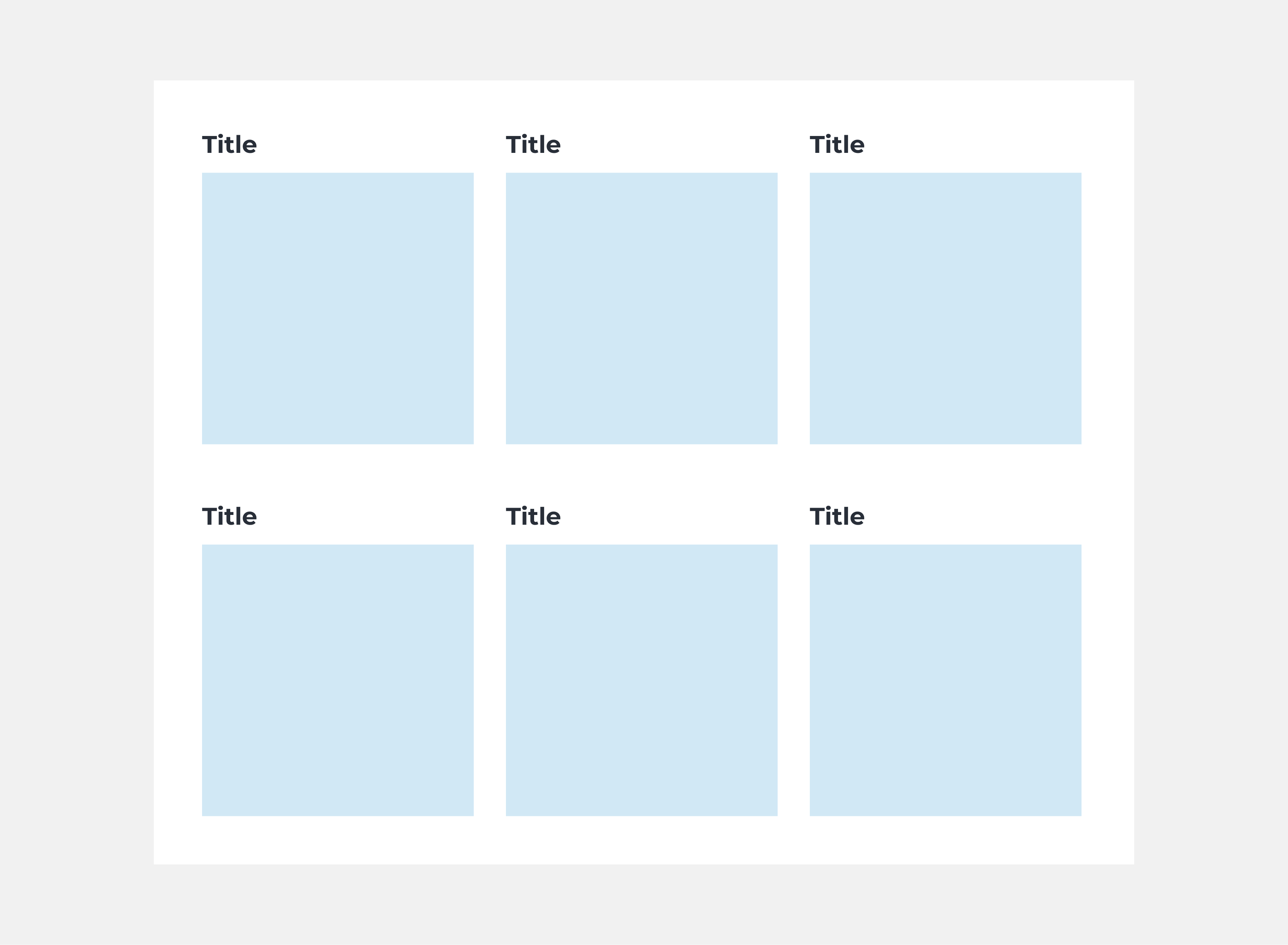
Simple design
In simple projects, a developer can usually predict how the interface should look on mobile devices independently. Typically, when the screen width is reduced, all elements stack "below each other." In a situation where he receives a user interface design but it lacks a dedicated mobile view, he can base his solution on a grid system that follows the described layout.
However, It is worth remembering that this approach has its drawbacks. Often, situations arise where certain parts of the application do not look ideal. In such cases, developers need additional time to adjust the application's appearance to the desired state through trial and error.
Even in seemingly simple projects from the designer's or business perspective, implementation difficulties can arise. It can happen due to the amount of functionality in the application or the appearance of individual components that cannot be easily adapted to a mobile view. While such situations cannot be entirely avoided, careful planning and providing comprehensive mockups can help minimize them. Ultimately, it turns out that it is usually more efficient and economical if the designer considers responsiveness during the project's creation phase. This allows for improved programming quality, avoids additional costs, and shortens the project's implementation time.
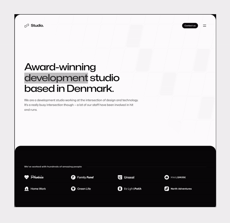
In this example, we see a simple application design with responsiveness taken into account, where all interface elements cascade and stack below each other.
However, It is worth remembering that this approach has its drawbacks. Often, situations arise where certain parts of the application do not look ideal. In such cases, developers need additional time to adjust the application's appearance to the desired state through trial and error.
Even in seemingly simple projects from the designer's or business perspective, implementation difficulties can arise. It can happen due to the amount of functionality in the application or the appearance of individual components that cannot be easily adapted to a mobile view. While such situations cannot be entirely avoided, careful planning and providing comprehensive mockups can help minimize them. Ultimately, it turns out that it is usually more efficient and economical if the designer considers responsiveness during the project's creation phase. This allows for improved programming quality, avoids additional costs, and shortens the project's implementation time.
In this example, we see a simple application design with responsiveness taken into account, where all interface elements cascade and stack below each other.
Complex design
In the case of more advanced interfaces, a developers’ dream is to get a design dedicated to mobile devices before starting programming work. Effective planning of the application architecture requires prior familiarity with designs containing all the details, edge cases, and necessary resolutions. Most of the time clients want to see desktop mockup first, so that's also what developers get.
Thorough analysis of business requirements and detailed preparation of designs form solid foundations for every project. They thereby minimize the risk of misunderstandings, errors, and unforeseen costs.
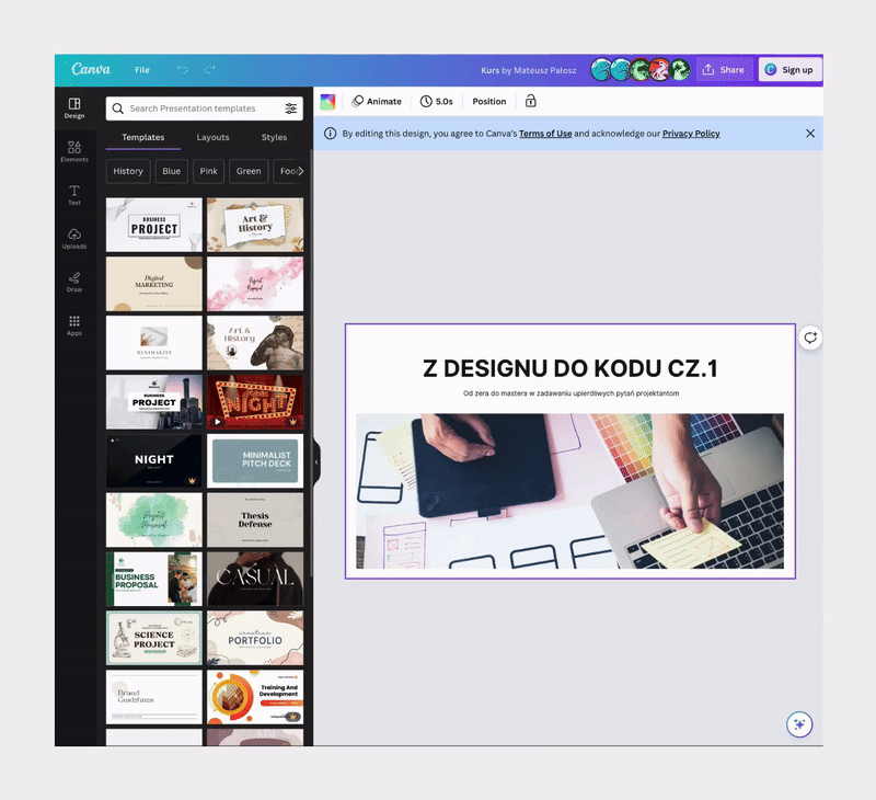
Let’s take a look at Canva Canva is characterized by a clear and minimalist user interface. In reality, however, behind this simplicity lies advanced architecture and a wide range of functionalities. When considering responsiveness, it turns out to be an incredibly complex project. All tools available in Canva have been precisely thought out in this regard. Some elements appear as separate entities or change their appearance depending on the screen width. This serves as an example of a situation where mobile design is essential.
Thorough analysis of business requirements and detailed preparation of designs form solid foundations for every project. They thereby minimize the risk of misunderstandings, errors, and unforeseen costs.
Let’s take a look at Canva Canva is characterized by a clear and minimalist user interface. In reality, however, behind this simplicity lies advanced architecture and a wide range of functionalities. When considering responsiveness, it turns out to be an incredibly complex project. All tools available in Canva have been precisely thought out in this regard. Some elements appear as separate entities or change their appearance depending on the screen width. This serves as an example of a situation where mobile design is essential.
Breakpoints
Before starting work on the application, we need to answer the following questions:
- What should be the maximum and minimum breakpoints supported?
- Do we want our application to be adapted for 4k devices?
- Do we want it to display on devices smaller than 360px?
- Which breakpoint is critical in showcasing the final appearance?
- Is the target audience primarily users of mobile devices?
- When should items be displayed as mobile, and when as desktop? Is a resolution of 1024px already considered desktop or still mobile?
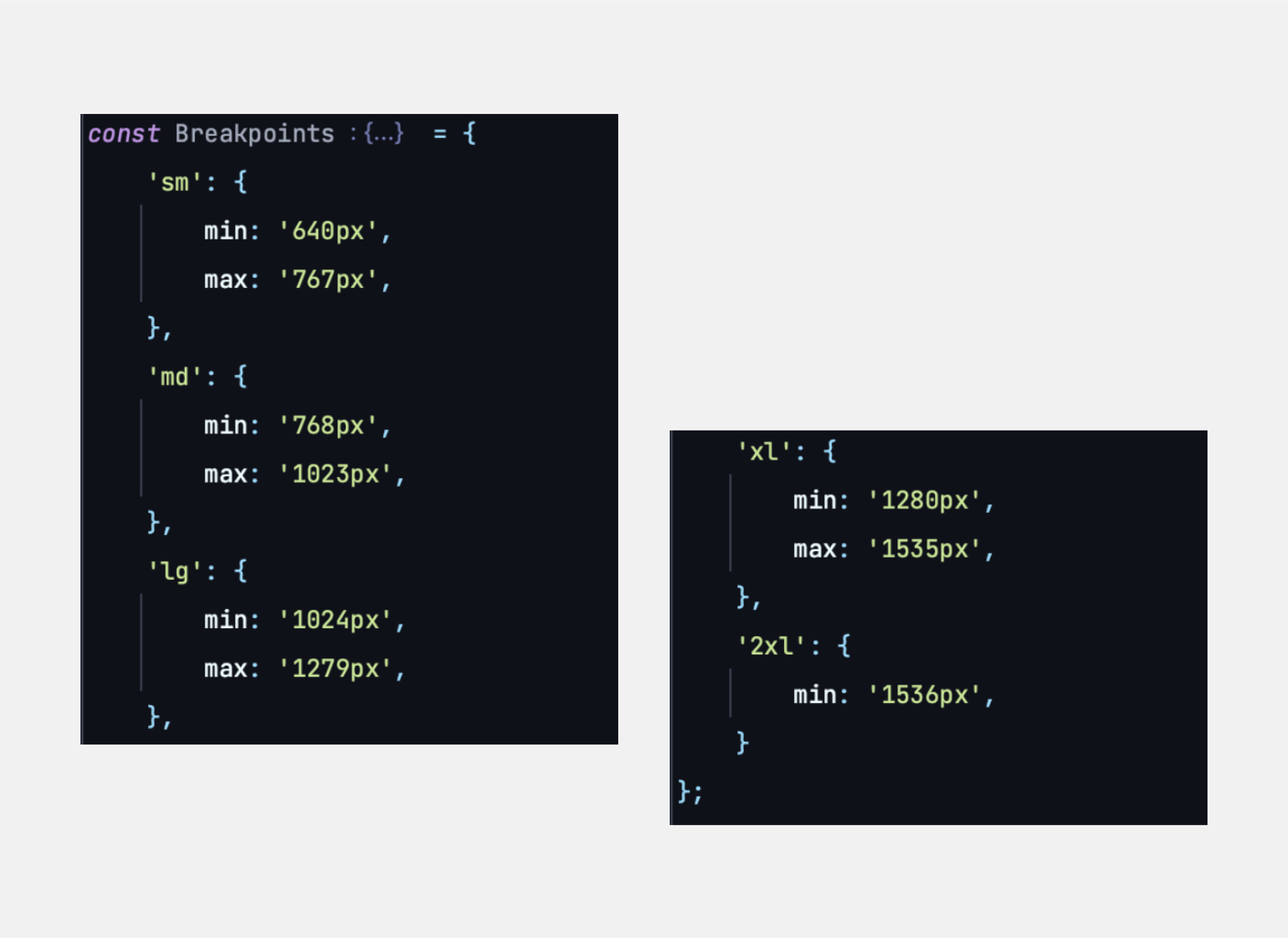
Having answers to these questions, it is important to think about breakpoints in terms of groups. This means treating the range of resolution, for example, from 360px to 639px, as a single entity. Focusing only on a specific value can lead to a situation where the page looks perfect on one device but poor on another with a slightly different resolution. Unfortunately, designs often do not take such groups into account, putting frontend developers in a challenging situation. They have to adapt to specific, often rigid design guidelines while ensuring that the application or website looks and functions correctly on a wide range of devices. This often means the need to create special, individual solutions for each device or resolution, not only prolonging the development process, but also potentially leading to inconsistencies in the appearance and functionality of the application.
What breakpoints could look like?
Although it looks like we have the most important breakpoints covered, it is extremely important to check how the application looks like on resolutions within the same group. Is everything working the same on 430px as well as on 360px?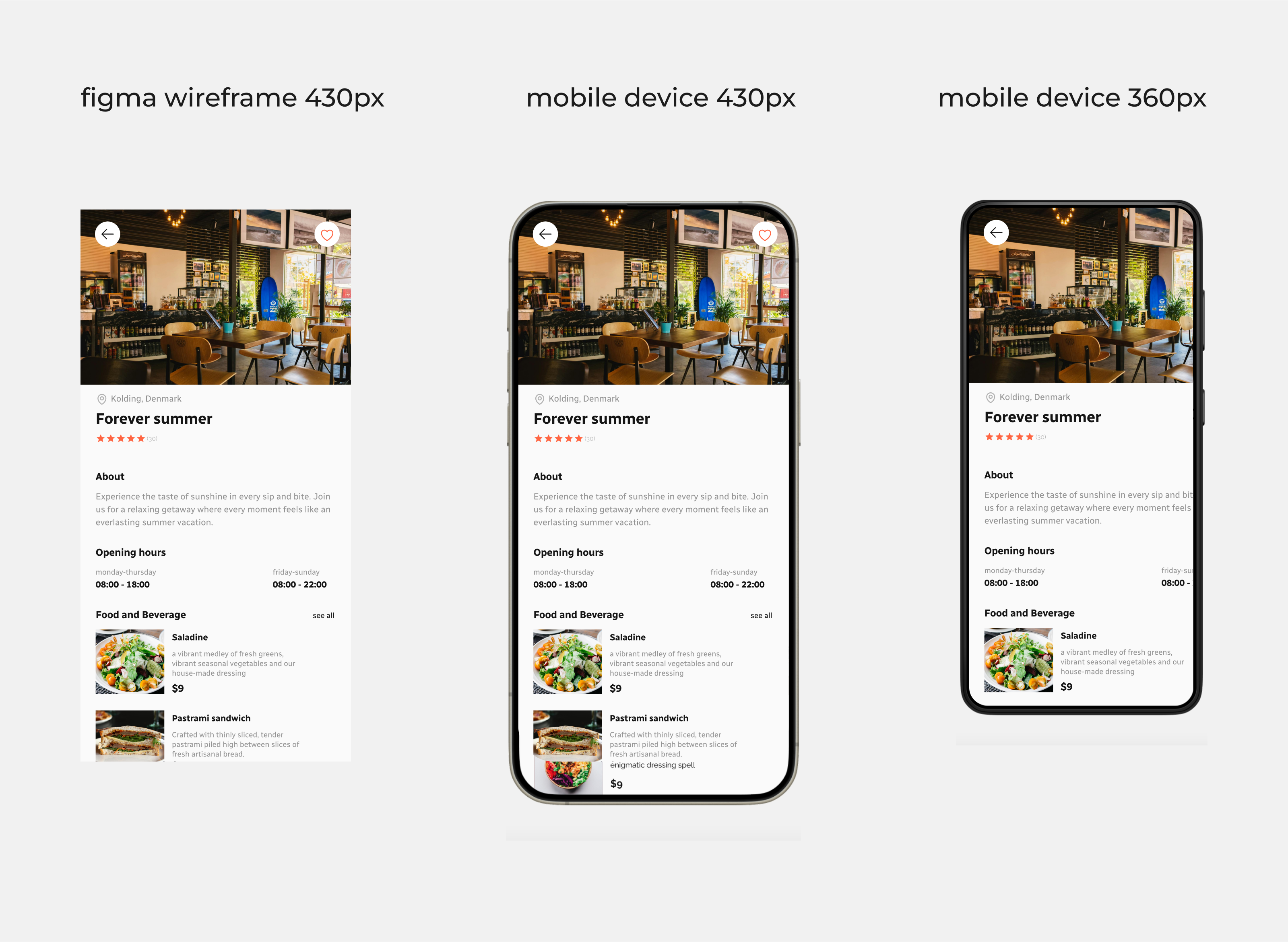
As you can see, the answer is NO.
This is one of the reasons why it is much easier (and faster) to build an application following the “mobile first” strategy.
- What should be the maximum and minimum breakpoints supported?
- Do we want our application to be adapted for 4k devices?
- Do we want it to display on devices smaller than 360px?
- Which breakpoint is critical in showcasing the final appearance?
- Is the target audience primarily users of mobile devices?
- When should items be displayed as mobile, and when as desktop? Is a resolution of 1024px already considered desktop or still mobile?
Having answers to these questions, it is important to think about breakpoints in terms of groups. This means treating the range of resolution, for example, from 360px to 639px, as a single entity. Focusing only on a specific value can lead to a situation where the page looks perfect on one device but poor on another with a slightly different resolution. Unfortunately, designs often do not take such groups into account, putting frontend developers in a challenging situation. They have to adapt to specific, often rigid design guidelines while ensuring that the application or website looks and functions correctly on a wide range of devices. This often means the need to create special, individual solutions for each device or resolution, not only prolonging the development process, but also potentially leading to inconsistencies in the appearance and functionality of the application.
What breakpoints could look like?
Although it looks like we have the most important breakpoints covered, it is extremely important to check how the application looks like on resolutions within the same group. Is everything working the same on 430px as well as on 360px?
As you can see, the answer is NO.
This is one of the reasons why it is much easier (and faster) to build an application following the “mobile first” strategy.
Mobile first
Mobile First is a web design strategy where the priority is to develop the mobile version of the website before the desktop version.
When taking a mobile-first approach to product design, the initial focus is on considerations such as screen size, loading speed, and content readability. Naturally, designers concentrate on key features and priority functions of the product. As the platform expands to tablets or computers, designers can leverage the unique features of these more advanced devices to gradually enhance the product.
Applying the Mobile First strategy in programming brings several benefits, including:
- Encouraging more thoughtful code writing by concentrating on key functionalities.
- Allowing the programmer to assess whether a given component is versatile enough to be expanded and adapted to both the desktop and mobile versions or whether it is preferable to create two separate components specifically designed for each version.
- When programming with a focus on mobile devices, there is increased awareness of the need for efficient use of available resources, such as images or scripts, and their optimization, resulting in faster page loading times. - After establishing the foundation for mobile devices, it becomes easier to adapt and extend the code for larger screens. Additional features, visual effects, or other elements specific to the desktop version can be added easily without the need to rewrite the entire code from scratch.
Components for Mobile or Desktop Only
Often, there is a need to create components that are specific to certain types of devices, designed exclusively for the mobile or desktop version. This arises from the fact that elements tailored for desktop may be inconvenient or impractical for users accessing the mobile version.
From a programmer's perspective, creating separate components has its pros and cons. Sometimes it is better to write a new component rather than create one large component with complex logic. Other times, it may be sufficient to compromise on functionality that seems best for a particular device and apply a solution that works well on both devices. Each case should be considered individually, and the following points should be taken into account to determine if there are better solutions.
1. Designers need to create two different mockups for the same component. Programmers must spend time preparing, developing, testing, and optimizing each version of the component. QA teams must consider differences on separate platforms.
2. Introducing a change or fix in one component may require a careful analysis and update in the other one.
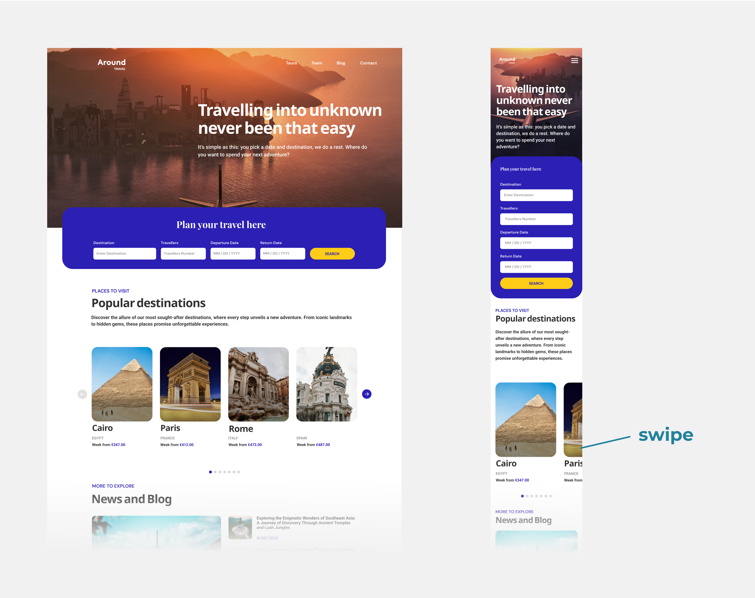
3. More code usually equals a higher chance of errors. Especially when functionalities are duplicated, there is a risk that updates or fixes made to one version may not be reflected in the other. For example, think about the carousel of pictures. If you don't want it to switch between the pictures by itself after some period of time, you will need a button.
On desktop it is a standard solution, so there will be no confusion, but on mobile? It is much more intuitive to swipe.
From a programmer's perspective, creating separate components has its pros and cons. Sometimes it is better to write a new component rather than create one large component with complex logic. Other times, it may be sufficient to compromise on functionality that seems best for a particular device and apply a solution that works well on both devices. Each case should be considered individually, and the following points should be taken into account to determine if there are better solutions.
1. Designers need to create two different mockups for the same component. Programmers must spend time preparing, developing, testing, and optimizing each version of the component. QA teams must consider differences on separate platforms.
2. Introducing a change or fix in one component may require a careful analysis and update in the other one.
3. More code usually equals a higher chance of errors. Especially when functionalities are duplicated, there is a risk that updates or fixes made to one version may not be reflected in the other. For example, think about the carousel of pictures. If you don't want it to switch between the pictures by itself after some period of time, you will need a button.
On desktop it is a standard solution, so there will be no confusion, but on mobile? It is much more intuitive to swipe.
Table
Basically the biggest headache of all components out there.
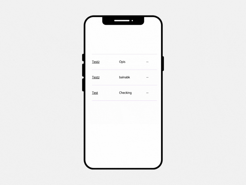
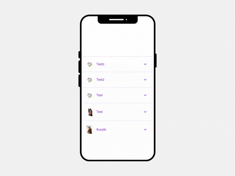
The table is an example of a component that, due to the amount of presented data and the multitude of operations that can be performed on it, poses a significant challenge in the context of Responsive Web Design (RWD).
The simplest solution that ensures usability of the table on mobile devices is to limit the width of the container containing the table to the screen width and add horizontal scrolling, as shown in the video below:
We can prepare a more comprehensive solution, that is, a specially designed component that imitates table view for the mobile version:
Both solutions have their pros and cons.
In the first solution, we avoid creating an additional component, which is advantageous from a programmer's perspective. There is less code to write and maintain. However, this solution may not provide a satisfactory user experience.
In the second solution, the benefits of an improved user experience require additional effort in creating, developing, and maintaining this component.
So it really comes down to deciding whether you have time and resources to create a more complex solution. Just remember to establish which one it will be before you start coding. It will save a lot of time.
Charts
Ok, maybe charts are the biggest headache.
If a client wants to have a chart displaying some data on their website, you should really take your time to design it properly. Consider each screen resolution and same as with tables, emphasize the mobile view. You can also consider using some libraries, for example chart js. They are fully responsive, but if you have a lot of data that you want to display it could not be a good enough solution, because it can omit some important information.
example here
Maybe it is better to show this data in some other way? Table, block of text explaining the data? Or display information on mobile devices “check this out on desktop”.
Long text problem
It happens too often. Developers get a mockup and start coding. Everything seems great. Until a tester goes through an app and ruins everything. I mean seriously, how many things can you break? The truth is that designers, while making mockups, should consider all (a girl can dream, ok?) edge cases. Our design team came up with a game “Trolls”. It involves destroying each other's mockups by testing extreme scenarios. I would highly recommend introducing this game to your company. It saves plenty of time and deprives testers of work. So it’s really a win-win situation. Just kidding, but seriously, consider trying it out.
What edge cases do I have in mind?
User profile - email:
jane.doe@gmail.com vs. jose.mariagonzalezmartinezsombrerolopezrodriqes@gmail.com
User profile - city:
Warsaw vs. Taumatawhakatangihangakoauauotamateaturipukakapikimaungahoronukupokaiwhenuakitanatahu
No, a cat didn’t just run across my keyboard.
 It is a city in New Zealand.
 Anyways, back to the subject.
For example, you get a mockup for a mobile device that looks like this:
 And then start coding. How does it look on a real mobile device?
Probably like this.
Long text problem doesn’t only apply to RWD, but I want to exhaust the topic here.
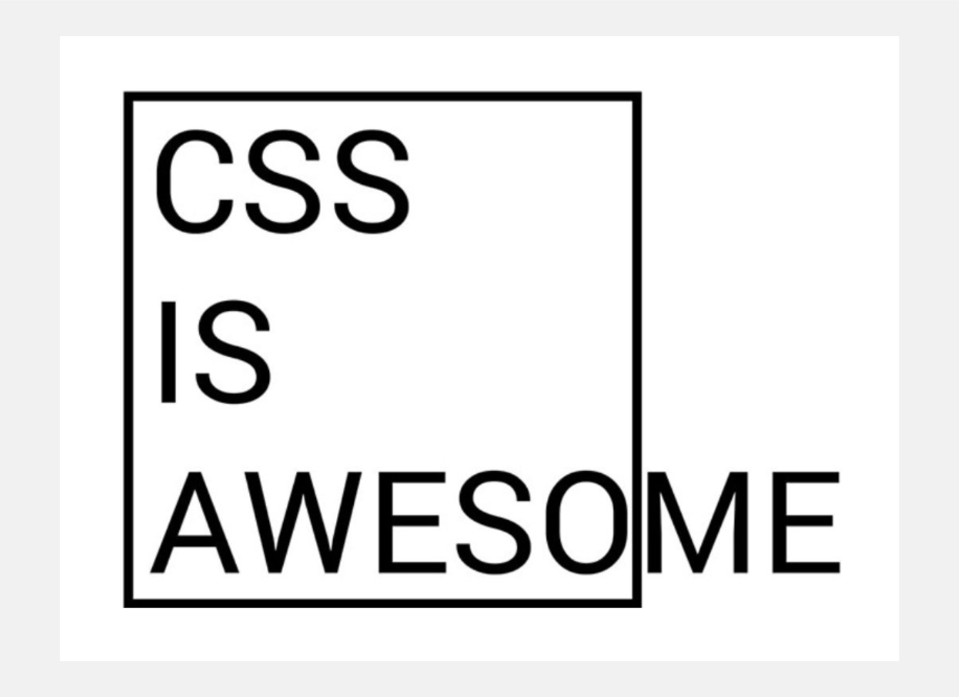
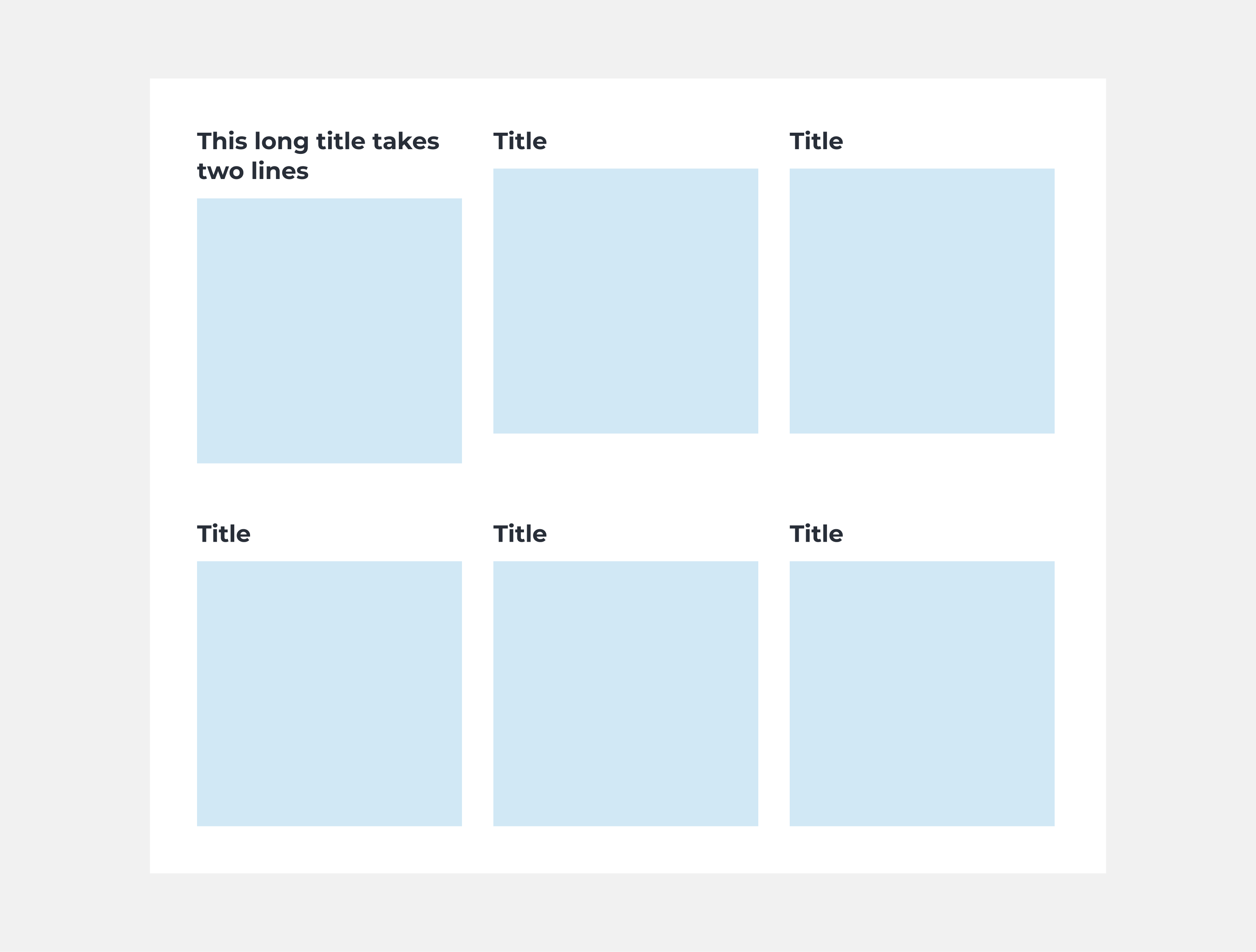
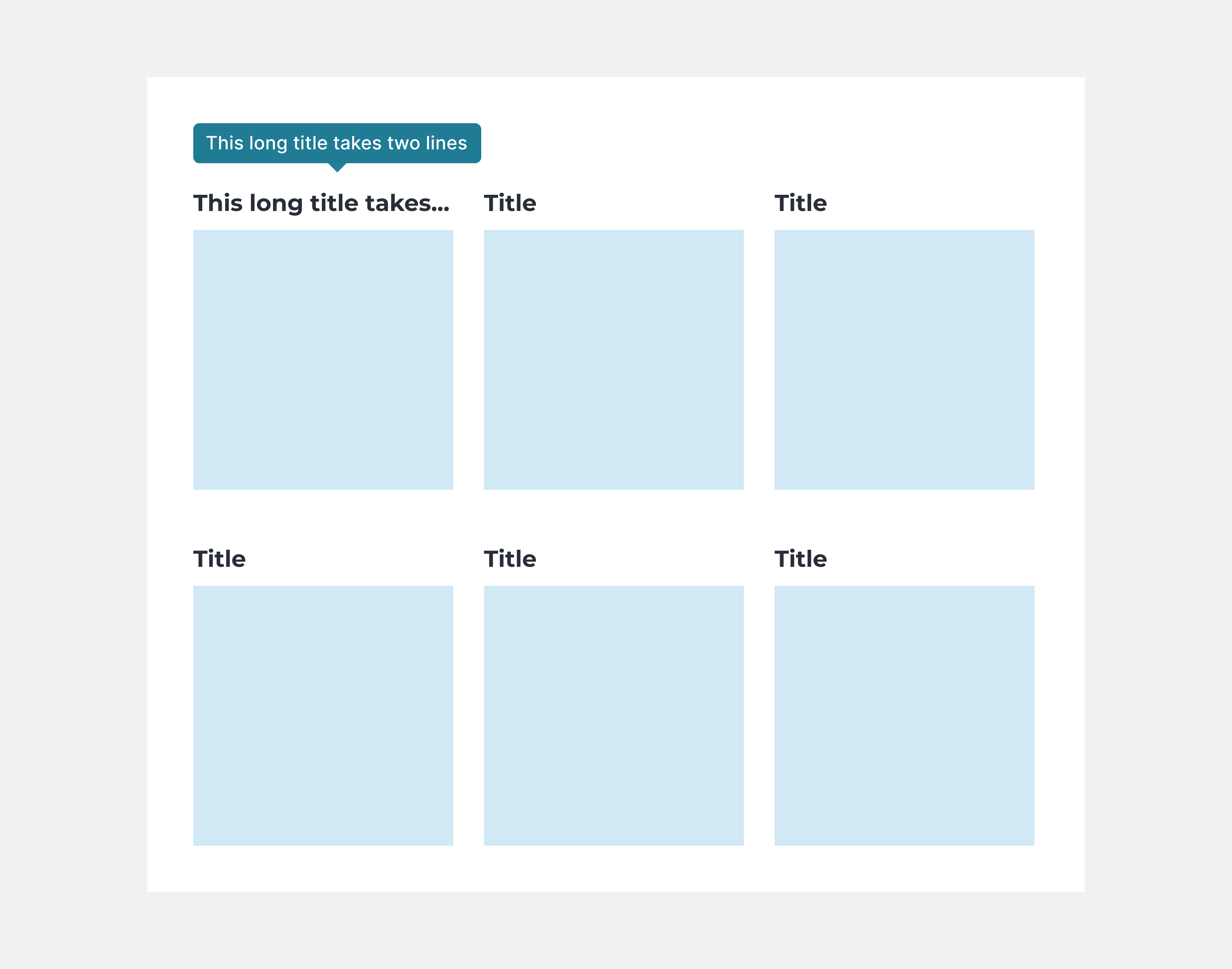
So, let’s imagine you get a mockup that shows a grid like this:
And start coding right away, without considering edge cases, you will most probably end up with something like this:
Doesn’t look so good, does it? Of course you can fix that, but you will waste some time, as most probably, it will be the tester that finds it. So it will need to go back to developers, they will send it back to designers and then developers again etc.
How much time could they all save if the mockup from the beginning looked like this?
Conclusion
Responsiveness plays an important role in designing applications, there are many things both designers and developers need to remember about. I still haven't covered the topic of pictures, but more about it soon…
My advice? Introduce “Trolls” to your company and save yourself time and your clients money.
Happy coding!/ Happy designing!
My advice? Introduce “Trolls” to your company and save yourself time and your clients money.
Happy coding!/ Happy designing!